
Planning a website application
by agrant on Dec 4th, 2013 at 10:54 am
We’ve all been there. It’s meeting time, you had all these great ideas for the new web project and someone, somewhere in the room is asserting loudly their grand idea of using fifty tabs, twenty frames and stock photography of the whitest toothed execs they can find. This is how they see it ‘working out’ and […]
We’ve all been there. It’s meeting time, you had all these great ideas for the new web project and someone, somewhere in the room is asserting loudly their grand idea of using fifty tabs, twenty frames and stock photography of the whitest toothed execs they can find. This is how they see it ‘working out’ and if we don’t listen to them we’re all doomed for eternity, or so it goes – some people around the table actually nod and agree.
At this point you’re probably staring into space and quite rightly so. Where have they been living all this time? It might work, but the chances of it being bug-free, easily upgradable and actually of benefit to the users are low.
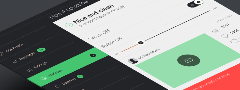
You don’t want to build this interface thats been suggested, not even a slightly better one, you want a great one.
You need to interject, now, but don’t just suggest something without having some concrete evidence behind your reasoning of how to do it better, otherwise it’s just simple point scoring. The web has propelled forward somewhat in the past few years alone, and you need to hit them square with this. Users need to be subjected to positive experiences when they use your website/interface if you want them to come back.
A fail-safe method for planning your pitch is to start with the basics, your users – what they need. If we take a look at the fundamentals and see what makes them happy in life, then we learn how we can build on that and how we can connect with them, how we transform the interface from being just a tool to work with to something that creates this positive experience. Why build something that just barely functions, when you can also motivate and satisfy their needs, right?
To take a look at what makes users and people in general happy, we can turn to some notable 1940’s research on human studies, a scientist named Maslow wrote a paper entitled, “A Theory of Human Motivation.” The outcome of which concludes that humans have five main requirements to be satisfied in life. With the basic research already in-hand, it’s quite easy to discern that these also translate over to interface design.
Humans vs Interface.
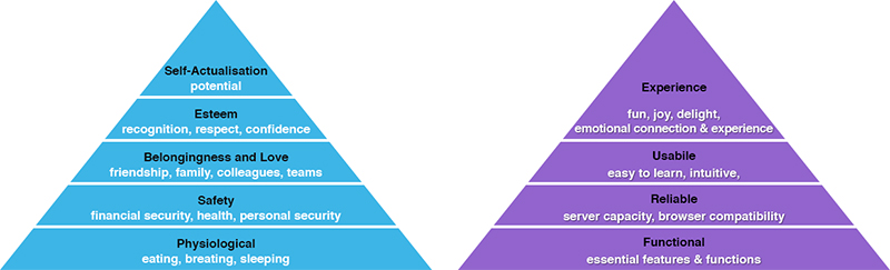
Physiological > Functional
You need these to go about your daily life with ease, the same goes for using any interface, the essentials need to be there in order to get anything done. This is one of the most important steps, really plan what functionality and features your going to offer, and for each of those anticipate what the user wants to do. Compare various versions until you drop, use wireframes to plan, and get input from future users! No search function when sorting through vast amounts of data – Why not save on breathing?
Safety > Reliable
Remember that global blackberry outage? People aren’t impressed when things stop working, it’s taken as a given usually, but be prepared and design with this in mind. You need automated backup and failsafe solutions. If you loose too much time, then ultimately you loose users too. Browser & device compatibility is also a must – know what can be done and on what, keep it standardised across the lot. Take for instance Spotify, their Computer, Smartphone and Tablet versions all have slightly different features and this drives their users who use it daily (such as myself) a little mad.
Belongingness > Usability
This is the anticipation part, if you’ve really planned well you’ll have a nice solid product. Take Gmail.com as an example, can you imaging how many people would have stopped using it if they didn’t show a loader after you sign in, just waiting there – staring at a blank screen – and this is with faster internet these days. Gmail is nearly 10 years old, born when the internet was still made of funny dial tones and long waits. Now look at it, it’s a sleek, well-designed powerful workhorse of grouped functions, overlaid email composition, drag and drop attachments, searchable mail, filters – pretty much every mail function you need. At the core though, it still informs its users so they know whats happening all the time.
Esteem & Self-Actualisation > Experience
Starbucks tells it’s employees their not just selling coffee, they’re selling an experience and it works, people don’t just want to wait in queues for their cups of addiction, they’re willing to pay for it. Everything from the interior design, choice of music, greetings of the baristas to the freshly brewed coffee, every step is well-executed to ensure customers enjoy the experience and come back again. Harmonious. Your end result should be like a barista veteran, everything working together – creating positive emotions during interaction. They’ll come back for more if you pull this off, probably with friends. This is the section where it all has to fall into place, if you’ve really completed the groundwork then you’ll know your users better than they do and it should come together. Don’t just assume it will though, really test here – see if theres anything holding you back from making the experience better.
Figure out the basics above and you’ve really started gathering the evidence to present during the next meeting. Present to everyone how you can build a better system, the thinking behind it, examples of other interfaces and products that just work seamlessly. Show the expected outcome of it all and the options for moving forward. Sure there will be issues along the way, but work as a team, meet regularly and share progress in detail to help minimise any issues. Not only will your users be happier in the end, but you as a team will have a much better time planning and working on the whole project. This is the story behind your product – it has been handcrafted with the user in mind from the start.
